Structure for a Multi-Brand design system variable library Part 1
Jul 28, 2026
8 min read
One of the biggest challenges when building a design system is supporting multiple brands. Before you create a single variable or component, there’s one important question you need to answer:
Is this a Branded House or a House of Brands?
The answer determines how you’ll structure your variables, components, and ultimately your entire design system.
The Two Types of Multi-Brand Design Systems
1. Branded House: A Branded House is when multiple products or brands share the same visual identity, with only slight variations. They typically use the same palette, typography, spacing system, and components, while changing a few brand-specific tokens such as primary colors or logos.
A good example is Google Workspace. Gmail, Google Drive, Google Docs, and Google Meet all have their own identities, but they share the same Material Design foundation and visual language.
Another example is Uber, where Uber, Uber Eats, and Uber for Business all share a consistent design language while introducing subtle branding differences.
2. House of Brands: A House of Brands is the opposite. Each brand has its own unique identity with little or no visual overlap. Colors, typography, components, and even interaction patterns may differ significantly.
Examples include Unilever, which owns brands like Dove, Axe, and Ben & Jerry’s, or Procter & Gamble, which owns Pampers, Gillette, and Oral-B. Each brand has its own distinct visual identity.
This is the first major decision you need to make when building a multi-brand design system because it influences how you’ll organize your variable collections, component libraries, and theming strategy.
In this article, I’ll focus on how I structure a Branded House design system. There are multiple ways to approach this, but the underlying principles remain the same. This is simply the workflow that has worked well for me.
My Variable Collection Structure
For a Branded House, I always create 2 core variable collections.
1. Primitive Collection: This collection contains tokens in their raw form. For example:
Blue/50 → #ECF4FE
Blue/100 → #D8EAFC
Blue/500 → #2F80ED
This applies to every color across every brand. The same idea extends beyond colors. You should also store your raw values for Typography (font family, font weight), Scale and etc
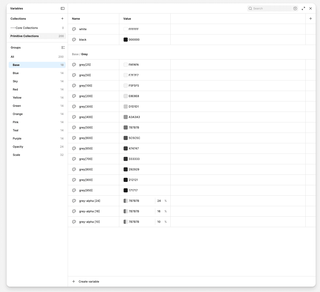
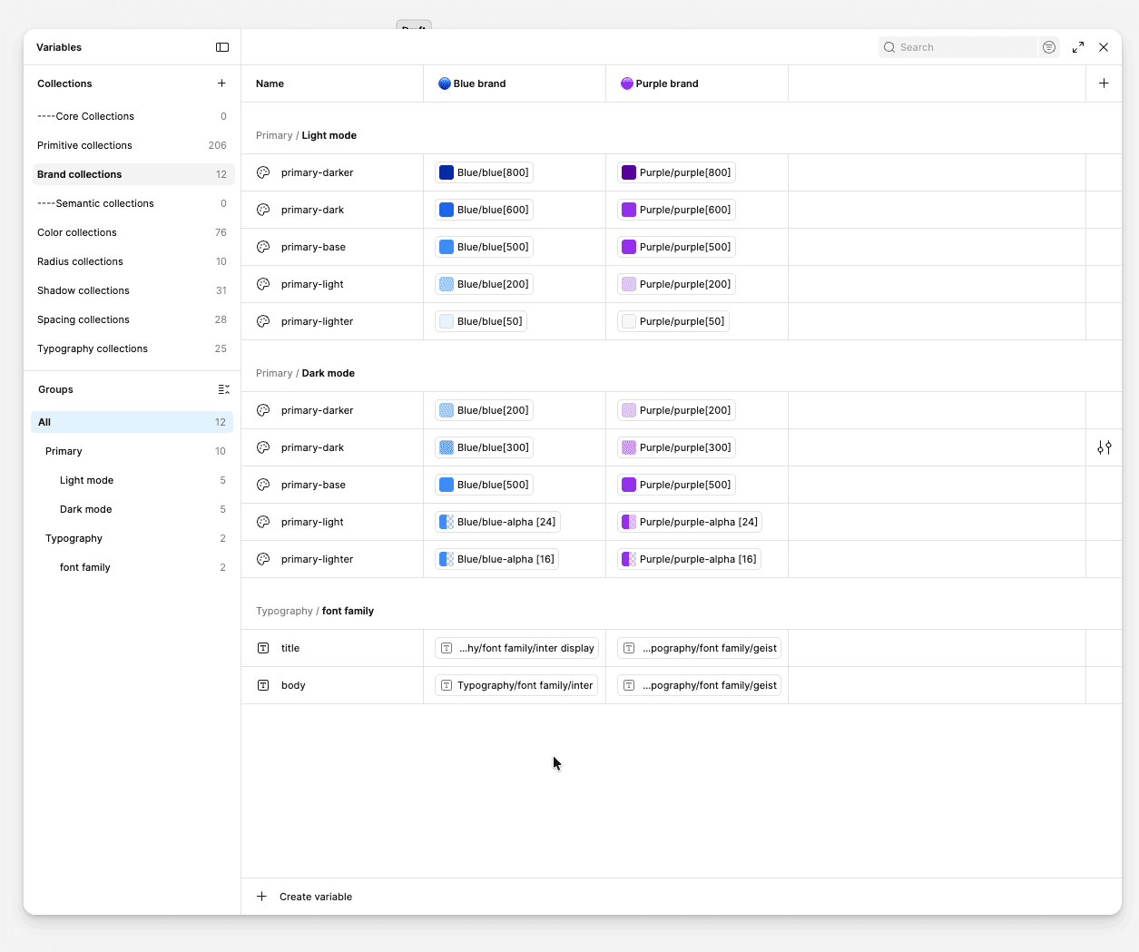
2. Brand / Theme Collection: This collection contains everything that makes each brand unique. Typically this includes:
Primary colors
Secondary colors
Brand-specific accent colors
Typography (if applicable)
Any other brand-specific tokens
Each variable should still reference your Primitive Collection.
Handling Light and Dark Mode
This is where things become slightly more complex. Since each brand has its own theme, I handle Light and Dark mode within each brand rather than creating separate modes for every brand/theme combination.
For example, under the Blue Brand mode, I create groups such as Primary, Secondary, Background, and any other brand-specific color categories. Within each group, I create Light and Dark subgroups, where I define the tokens for that specific category.
I follow the same structure for every color category that requires different values between Light and Dark mode. This keeps the variables organized, makes them easier to find, and allows each brand to manage its own theme without cluttering the variable library
This keeps all of a brand’s color tokens grouped together while still allowing Light and Dark mode variations where needed. It also makes the variable library easier to navigate and maintain as more brands are added.
Organizing Token Collections
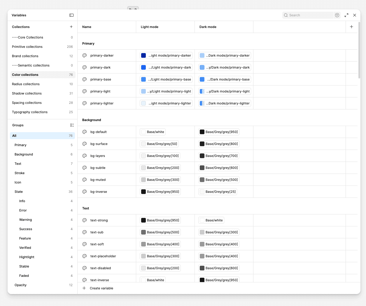
Once the two core collections are in place, I create separate collections for different categories, such as:
Color (text color, primary color, icon color, stroke, etc)
Typography (font family, font Weight, font size, line height)
Spacing
Radius
Shadows (opacity, spread, blur, position-x and position-y)
I prefer splitting them into separate collections because it keeps the variable library organized and makes searching for tokens much easier as the system grows.
These collections then reference the appropriate variables from the primitive and Brand collections.
Bringing It All Together
With this setup, you gain complete control over theming across your components and any designs built with the variable library. Instead of maintaining separate component libraries for each brand, you only need one component library. By switching variable modes, you can instantly change between different brands as well as their Light and Dark themes.
One final recommendation: for your Primitive and Brand collections, make sure to disable all Variable Scopes (uncheck every property in Scope). These collections are meant to act as the foundation of your system and shouldn’t be applied directly to design layers. Instead, your semantic collections (such as Color, Typography, Spacing, Radius, etc.) should reference these variables and be the ones designers interact with.
This extra layer of abstraction keeps your design system cleaner, reduces the chance of incorrect variable usage, and makes future maintenance much easier.
Final Thoughts
This is the structure I use when building a Branded House multi-brand design system. It keeps variables organized, makes theming easier to maintain, and scales well as new brands are added.
There are plenty of valid ways to structure a multi-brand design system, but the important part is creating a system that’s easy to understand, easy to maintain, and flexible enough to grow with your products.
In the next article, I’ll walk through how I approach a House of Brands design system, where each brand has its own completely independent visual identity.
I’d love to hear how you structure your own multi-brand design systems. If you have a different approach, feel free to share it in the comments.